About a week ago I held a creative workshop with one of my teams at SVT. Today, while an autumn rain fell outside the windows, we had a follow up session.
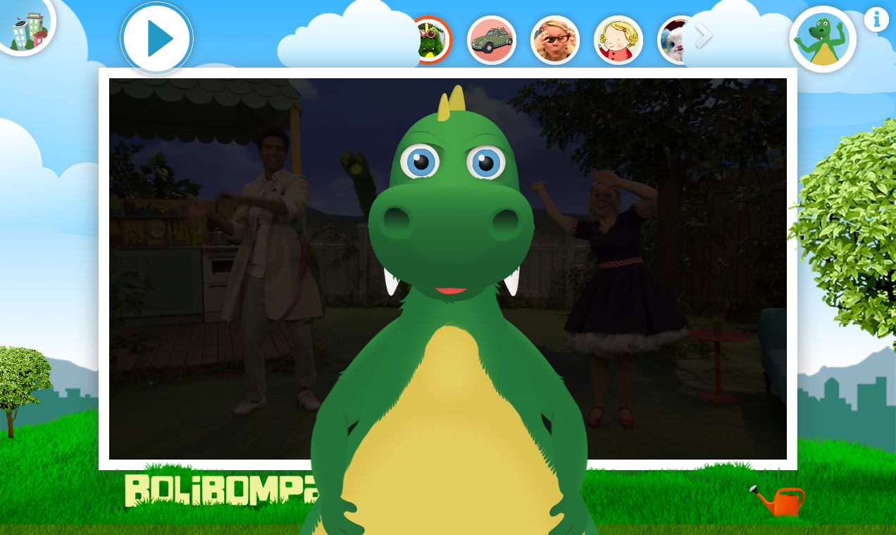
Since the workshop I have analysed the prototypes, my colleagues notes and my own observations. The result was a list of statements about the experience in the artefact and three prototypes of my own. The statements where for example “The Play/Pause button is placed on top of the video” and “The Play/Pause button does not fade away – it’s always visible”.
Today the team met in a small room here at SVT. I had put up the prototypes from the workshop on the wall and we went through them to get a reminder and start to think “User Experience” again. We then discussed, at a slow pace, the statements about the artefact. During the discussion I pointed to the prototypes that each statement was inspired by and my colleagues came with lots of great comments and new ideas. We then looked at my three prototypes and clearly dismissed one of them (it’s amazingly fun, but too difficult to build well). For the other two we created a sort of middle ground and an idea about how we can first build an easier but slightly boring version and over time make it more fun. Finally we quickly discussed what we most desperately need to validate with children.
During the session I changed my mind on several items and got great new ideas from my colleagues. The three prototypes I had is now just one. We also have a few aspects we can check with kids during our testing sessions next week. Those where amazingly well spent 90 minutes!


