A digital system should be a place where individuals can have experiences. However, “making place” in digital interfaces require the ability to get a mental image of the software – it requires structure.
Yesterday I discussed a taxonomy of Experience Structures that I feel is useful for strategy and concept development. Today I will discuss what happen when a system’s Experience Structure does not have integrity.
The examples are a bit Facebook bashing, which is not the point. Facebook does many things really frickin’ well.
Facebook Photos
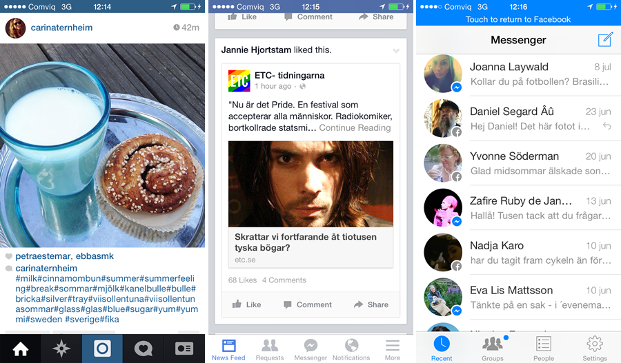
Facebook recently bought Instagram but have chosen to keep the app separate from the main Facebook experience. In essence the Instagram app is its own system with the app displaying a monolithic structure and the recently launched web experience being a sort of crippled replica of the app.
Now imagine if Facebook where to rename Instagram to “Facebook Photos” without changing the apps graphics or interactions and not having photos from the app show up in the News feed on facebook.com. That would be truly unexpected to many of those who use both Facebook and “Facebook Photos”.
Facebook Messenger
Earlier this year Facebook introduced it’s Messenger app for iOS. The app was first a companion to the Messages-function in the Facebook app but after a while the built in function was replaced by the new app. The Messages-icon still exist in the navigation bar in the Facebook app, but tapping it takes one to the Messenger-app.
The official reasoning for this structure is that the Messenger app deliver messages faster. And that might be true, not the least because the Messenger app keeps nagging users to turn on notifications for it. But jumping between apps feels weird. This is exaggerated by the fact that the Messages-icon exist in the Facebook app navigation but does not behave like the other icons.
A “Facebook Photos” that does not have a strong connection to the main Facebook experience would decrease the integrity of the Facebook User Experience Structure. A Messenger app that one is forced to jump to from the main Facebook app does the same.


