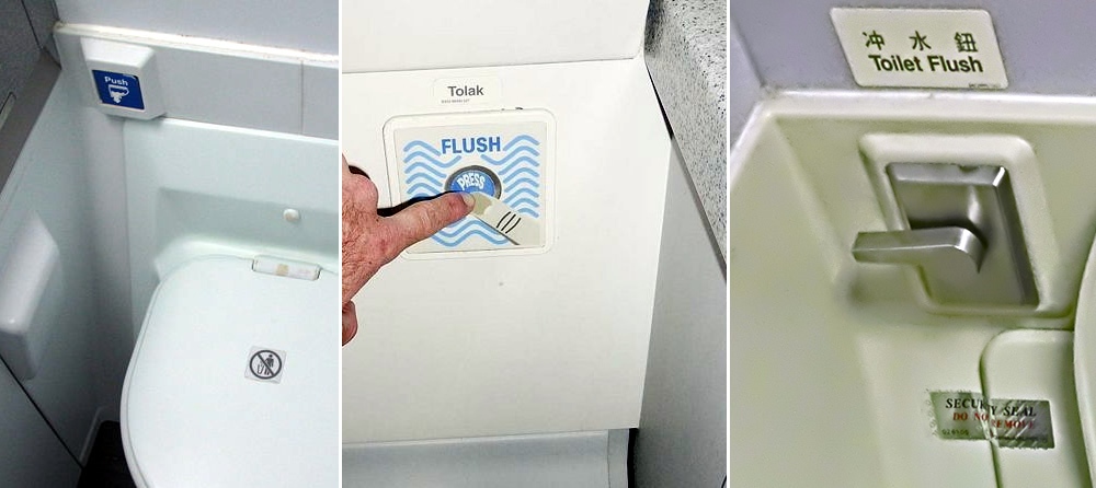
Been to an air plane loo recently? I bet you have. Thought about the flush button in there? Unfortunately, you might have. That’s due to the poor interaction design of the button.
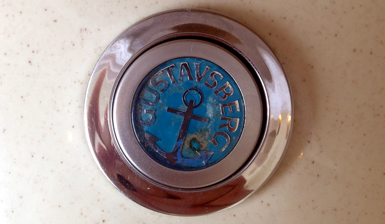
The lovely, round blue coloured button that illustrate this post is from a hotel toilet, I.E. not from a plane. I believe the toilet was installed in the 1950:s or 1960:s. That button has been pushed a lot and still communicates it’s function well.
The button is placed on the water tank and as the water tank is clearly a part of the toilet, the flush button also seems to be part of the toilet. The flushing parts are raised from the tank lid and the button is slightly higher then it’s containing manchette. It thus “affords pushing” as Donald Norman might put it.
Pushing a button on a water tank to flush is of cause an action we learn. However, the button-on-water-tank system has integrity in ways other flushing systems do not.
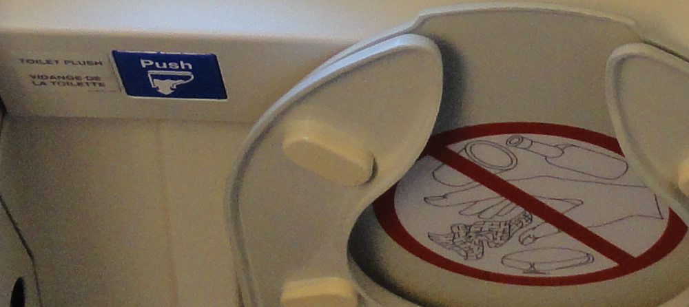
In air planes, the water tank is hidden and the flush button is often placed on the wall behind the seat, thus making the button and the seat two distinctly separated parts. The placement require me to analyse and understand their relationship, to understand that they are part of the same system. An obvious clue as to the failure of this interaction design is the need for the flush buttons to be labelled with a visual representation (the “toilet icon”) or text (“Toilet flush”).
A separate problem with the flush button above is it’s lack of accessibility. The button is inset in the panel and thus blind persons will have difficulties finding it. Here the lazy designer did not even give blind persons a Braille label to read. To the designer’s credit the blue colour makes the button stand out against it’s background, thus enabling persons with low eye sight to see it. The button is also quite big, which enable persons with less movement in their hands to push it.
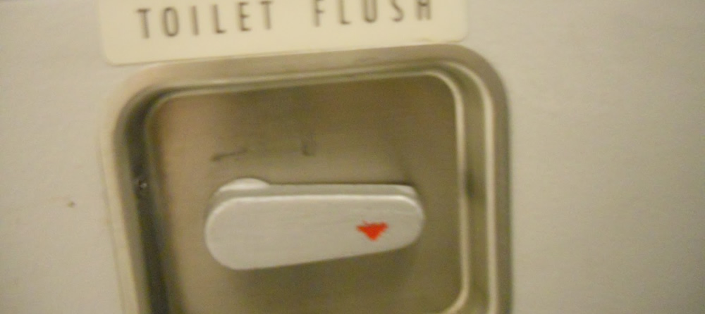
The downwards-facing red arrow on the above lever is an other bad design decision, put on the device by the designer to not have to take responsibility for the lack of usability of the system. The lever also require fine motor skills and hand strength that some people lack.
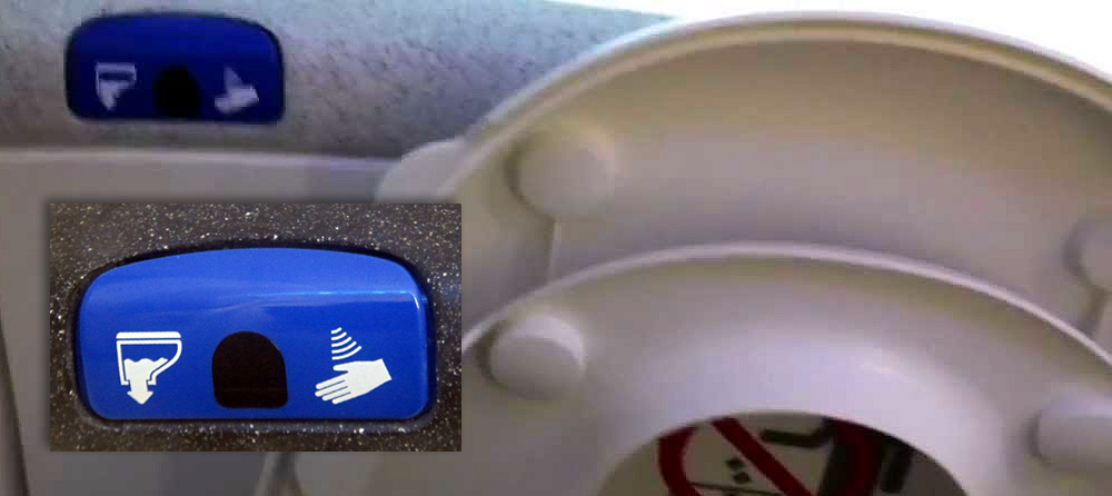
The Dreamliner has a sensor that you wave your hand in front of to flush. I’ve also seen sensors used to flush in some airport loos. The non-haptic interaction might be smart for many – it will decrease the amount of germs one interact with – but again the flushing-icon and hand-waving-icon tell me that the designer did a poor job.
The visual representation for hand-waving is also quite non-standard and quite poorly designed – I first thought it meant air based hand drying, as in the Dyson Airblade. The Dreamliner is one of the worlds most modern planes, but there is no Braille here, thus requiring blind persons to be assisted in finding the mechanism.
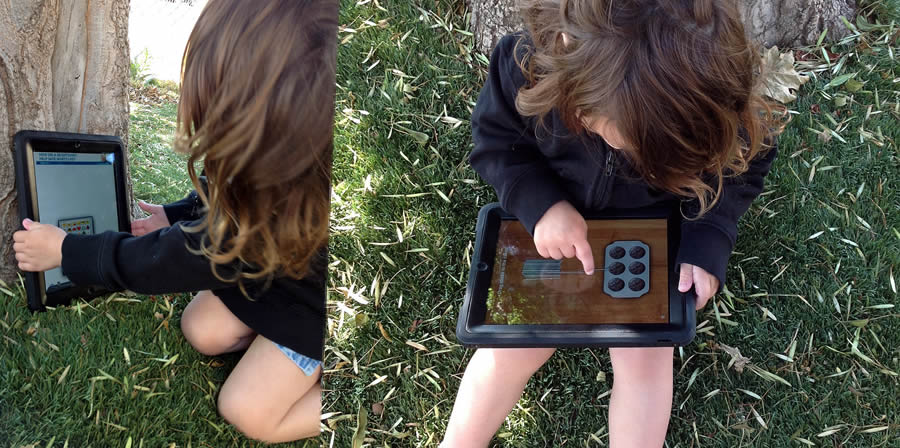
The Dreamliner picture above is from a YouTube clip that explain how the flushing works. Sure, there are YouTube clips about everything, but how to flush a toilet? Then something must be too poorly designed (or very innovative).
