Some shower faucets have more then one outlet – one for a shower head and one for filling the bath tub, for example. In these, the water temperature and water flow is set once and a lever is used to switch between the outlets. The design of that switching mechanism can be quite horrid.

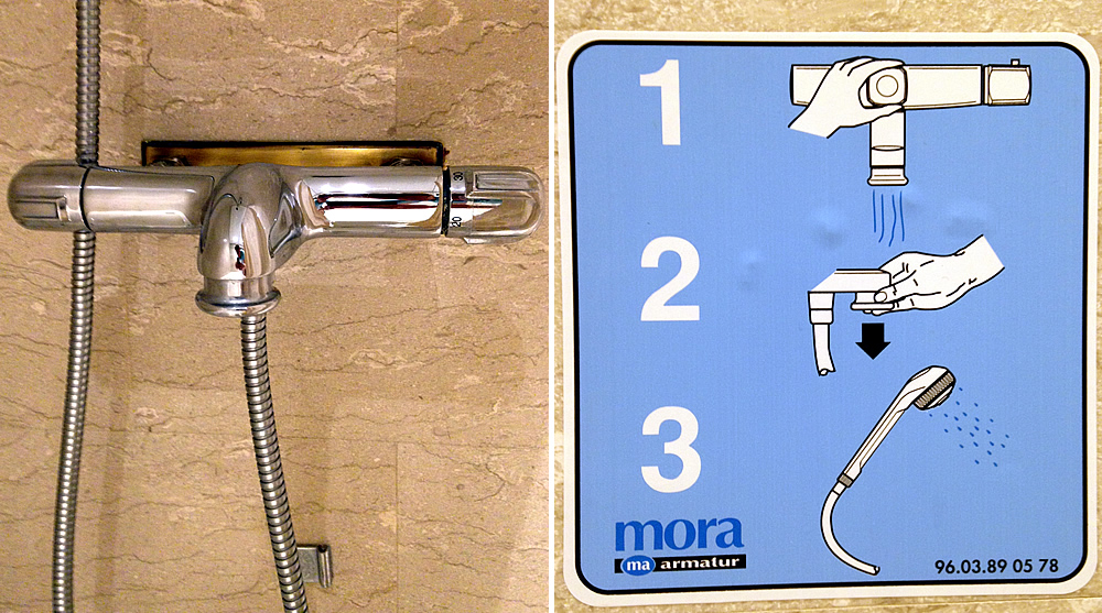
In this shower, water pours down into the tub when the tap is opened. In order for the shower head to get water, one needs to pull the metallic ring around the pouring water downwards.
However, the ring does not in any way indicate that it is moveable rather then soldered to the rest of the faucet. Therefor an IKEA style instruction sheet has been glued to the wall of the shower room. As I have discussed in an earlier part of this series: a clear sign of failed interaction design is when an interface need separate instructions. In this bathroom, the instruction sheet is not even accurate. Can you spot the error?

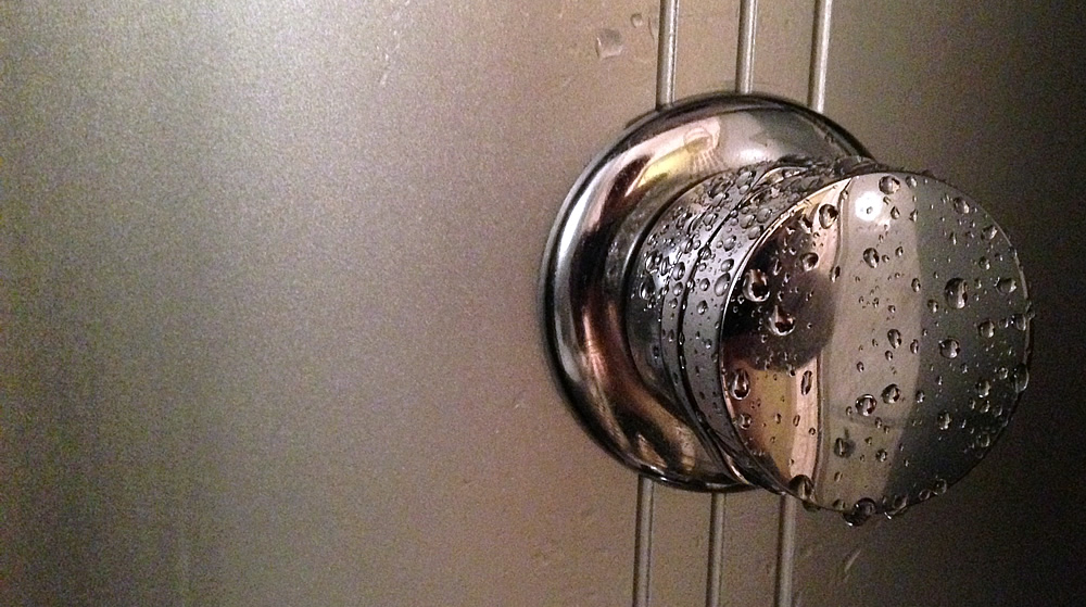
This is placed in a shower cabin with 4 different outlets: a hand held shower head, a “rain” shower, a foot massager and a back massager. One switches between the outlets by turning the knob.
The knob is obvious in it’s basic function: it clearly affords turning. However, the knob require quite a lot of fine motor skills and hand strength to turn. Worse yet is that there is absolutely no indication on the knob or around it for how to turn it to let the water flow into the different outlets. One has to move the knob around and hope that the wrong outlet is not turned on.
Tomorrow: Some lessons for the digital world from this exploration of bathrooms

