We started building an e-commerce tool for librarians to license individual eBooks. The first version was partly good, partly awful. It is getting better, a little at a time.
Category: usability tests
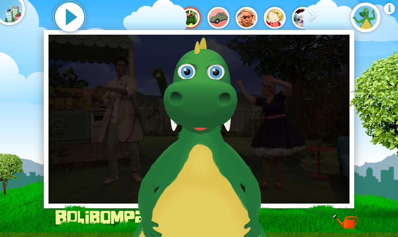
Interaction design: The Bolibompa dragon
Part 13 of 13 in the series Some of my skills.
All adults know that dragons giggle when they are tickled. But many kids have not found that out yet. So we in the Bolibompa team set out to build a digital dragon who kids relate to and whom they want to tickle! A Ticklish Mission.
Interaction design: The date range picker
Part 6 of 13 in the series Some of my skills.
Unfortunately the standard browser interface for choosing dates is really confusing. To reduce the effort of using some Springer Nature forms, I needed to create a custom date range picker. A British solution
The 3 roles of research
Creating a foundation, validating ideas and ensuring usability is where research with customers can provide value when we create digital products. But how?
Human-centered as philosophy
Part 2 of 5 in the series Human-centered product design in 2019.
I love to understand humans and their desires (or, at least some humans). I also don't want to waste time. This perspective makes me human-centered.
7 ways to infuse the scrum team with research findings
My team wants to understand why we build the things we build. So, how can I get our users into their minds? It's all individual...
Groups are hard to change. That’s ok.
A concept should always solve specific problems or create a clearly defined new opportunity. There is always more then one solution to any concept task so chose a solution that can be created within the boundaries of your available resources. "It's ok, just chose an other concept."
Quick usability tests
Part 1 of 5 in the series 4 ways I meet "users".
In this first part of a short series on participatory design methods I write about usability tests. The tests help me prove if my solutions for important details in my artefacts work or if I have to "go back to the drawing board". There are an enormous amount of persons who know more then I do about the things I design.
Paper Prototyping in User Experience Design
Part 2 of 8 in the series Deliverables.
On barnkanalen.se we have a few very popular coloring books. In May 2013 we where tasked with enhancing the functionality of the painting book. I used Paper Prototyping as my main tool to define the interactions in the admin interface before it was developed.
Lessons for digital products
Part 6 of 7 in the series Bathroom User Experiences.
Use the human ability to see connections between separate parts of a system. Build products that help us improve the world a bit. Build accessible artefacts. Make the important system states obvious. If your interface needs instructions, you have failed.
Don’t know what a triangle looks like? Play CamQuest!
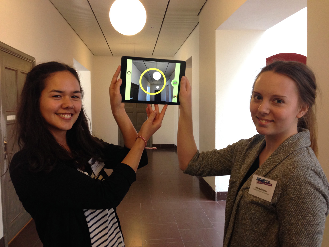
Game-apps for preschoolers can skip storylines and big goals and can benefit from enabling two kids to play together. These where two of my take aways from a paper presentation about the app CamQuest.
Kollar du på program på English, Suomi, Deutsch et cetera?
We who work with Barnkanalen.se want to give all children in Sweden the possibility to watch kids programs. Do you want to help us?
Hur kollar din familj på webb-tv?
Vi är intresserade av att träffa några familje-konstellationer som ibland eller ofta tittar på tv eller film på webben. Vill du och något/några av dina barn (3-11 år gamla) ställa upp?
Nu vet vi mer om vad som funkar på barnkanalen.se
Tack vare fjärdeklassarna på Mohedeskolan vet vi mer om hur vi kan bygga vidare på barnkanalen.se. Bland annat vet vi hur det ska funka att starta avsnitt och kolla på filmer där karaktärerna pratar engelska.
