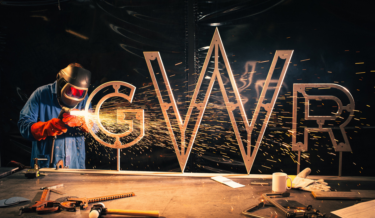
I was recently asked to give an example of where I get my inspiration. I immediately though about the transformation of the British train operating company First Great Western into Great Western Railway (GWR).
Through a handful of sources I have experienced this change “from afar” and while my sources are limited, solid work seems to have been done by GWR and it’s consultants Pentagram, Mark Taylor and ORM.
The process started when First Group (owners of GWR) needed to re-imagine the company brand if they where to win a bid to continue operating the railway lines. They had Mark Taylor lead the branding work and after research and analysis he delivered a new vision and purpose for the company as well as a suggestion to reinstatement the lines original name, Great Western Railway. He also worked with employee engagement and was part of choosing Pentagram to do design work. Mr. Taylors Brand Emporium write about their work with GWR.

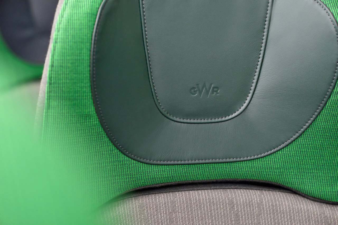
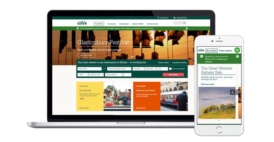
Pentagram created a visual identity based on seeing the company as a prestigious and straightforward “person”. A new mark, colours and typeface where designed or chosen and their work has been implemented in a plethora of ways: on tickets, on the exteriors and interiors of the trains, on the new website and app (created by ORM) etcetera. Most recently Pentagram redesigned the ticket office at Paddington station. Pentagram write about their design work.
What fascinates and impresses me about the GWR re-imagining is that the process seems to have been suitably chosen and solidly executed. Extensive research, analysis and synthesis has been done by Mark Taylor, Pentagram and ORM for the different parts they where responsible for. I hope, and think, that research results where shared between the parties.
Even I, who do not live in Britain, get inspired by the brand idea “The Renaissance of Rail” which was forged by Mark Taylor. The visual identity that was designed and implemented by Pentagram seems suitable and straightforward while still having a touch of modernity. The gwr.com landing page gives me many of the functions that I as a frequent traveller use: booking options and high level and detailed network status. ORM have also managed to keep the amount of “advertising” on the landing page to a level that I can live with (getting organizations to chose to exclude stuff is often a great challenge).
Hard work that is well managed and give great results. That is something to celebrate!
