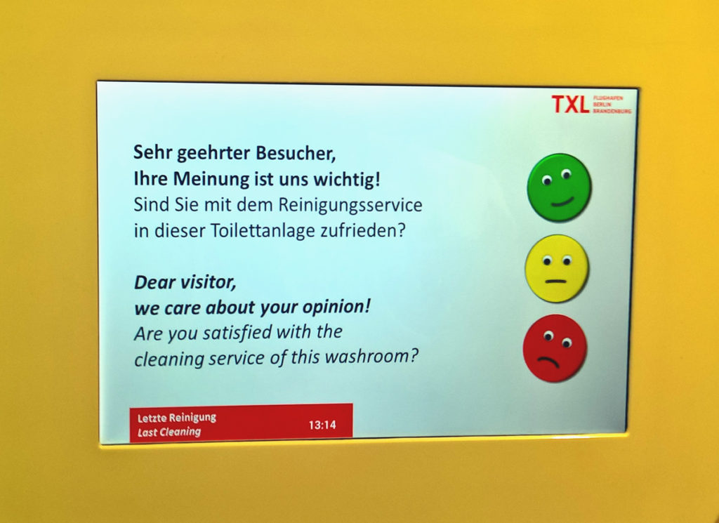
In public loo’s it is common to find these kinds of quality assessment tools. I have worked with quality assessment at IBM, am an interaction designer and seem to have a general fascination with toilets. So these screens are intriguing to me and I have a feeling that these systems have quite low use and do not accurately measure what they try to.
Some problems
The screens ask for generic feedback on the full experience – toilet, sink and walking/waiting areas. How can they know which part I am rating?
On average, the rating the system show is probably worse than what is reality. We are more likely to give feedback when we are dissatisfied than when all is good.
I might be having a bad day. “Taking it out” on the rating box is an easy way of getting some aggression out of my body.
Most importantly: There is no indication in this system that I will have real impact. My “vote” might cause a reaction of some kind from the cleaning management staff. But there is no indication of that. So, I assume that the voting will just end up in a database somewhere, unused and forgotten.
My suggestion
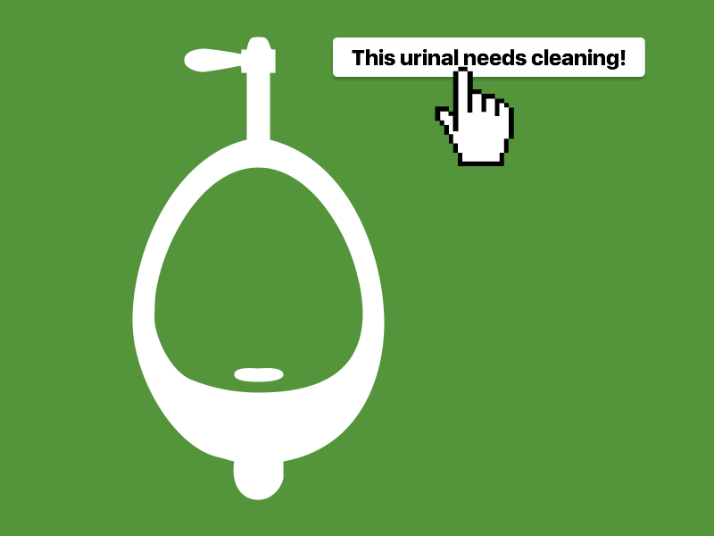
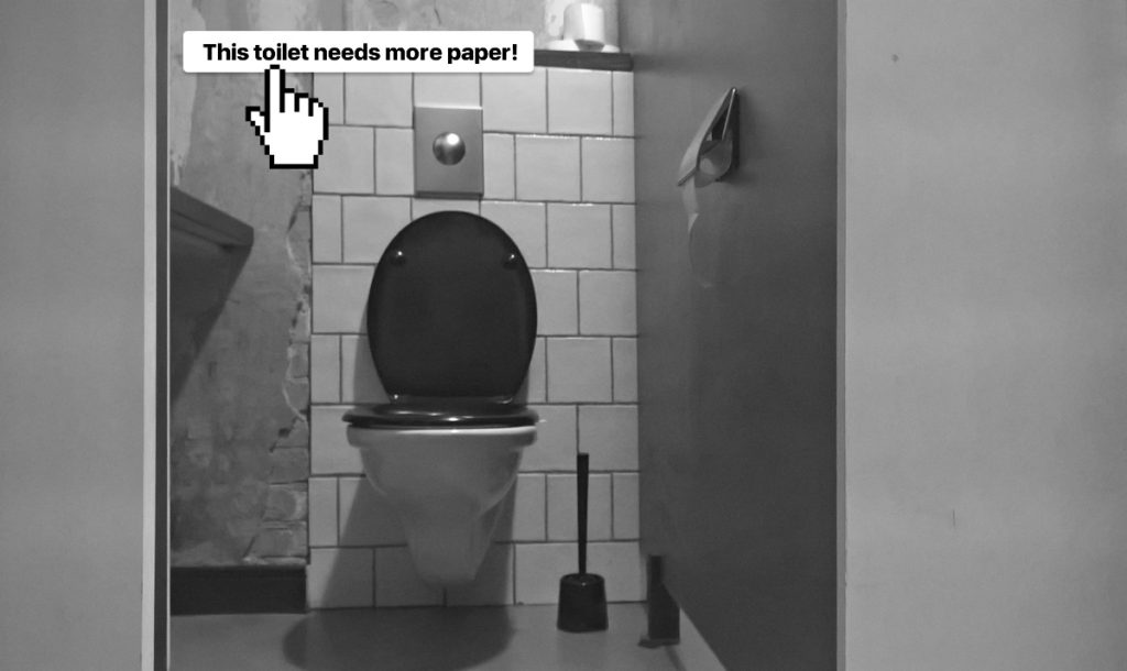
Ask us to “press a button” when a specific action needs to be taken, such as soap being refilled, a toilet unclogged or a Wunderbaum exchanged.
This would:
- make the action specific rather than generic
- make feedback accurate as we never ask if things ar good, just wether they are bad
- make it more difficult for me to to take “my bad day” out on the system
- make it clear to me what my “vote” will be used for – someone will hopefully come to the toilet with some more paper :)
By being specific rather than generic the cleaning staff can also use the system as an indication of what to do next, in their workday. They will get a live dashboard of specific actions they can take to make toilet visitors more pleased.
Toilets are seldom sources of joy. But they can be comfortable. A button next to the urinal can help enable that!
